缘由
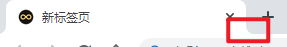
无意中发现google浏览器标签的小圆角上面正常下面是像外侧圆角的,当时就很好奇,这是怎么实现的,于是自己就开始干了,最初方案用的是js实现的,然后搜索一下CSS也可以实现同样的效果。
🚙js 方案
监听 li 的点击事件
每次点击是首先判断 li 是否为第一个或者为最后一个 如果为第一个就没有上一个 li 所以不用圆角,反之下面的 li 就 不用圆角
通过类名的添加和删除来实现是否圆角
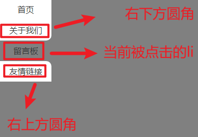
🔎原理 就是 让当前点击的 li 的上一个 li 的右下方圆角 和 下一个 li 右上方圆角,在这个过程前要先判断是否是第一个li(因为第一个 li 没有上面没有 li )和是否是最后一个 li(因为最后一个li 下面没有 li),这两种情况要单独操作
如果是点击第一个(上面没有 li) 直接给下面的 li 添加圆角类名
如果是点击最后一个(下面没有 li) 直接给 上面的 li 添加圆角类名
其他情况 都要添加类名
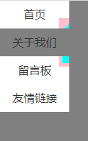
这里虽然和google标签页的样式不一样,但是我感觉这种排列方式还是比较常见的
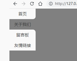
DOM结构 1 2 3 4 5 6 7 8 <div class ="main" > <ul > <li class ="active" > <a href ="#" > 首页</a > </li > <li > <a href ="#" > 关于我们</a > </li > <li > <a href ="#" > 留言板</a > </li > <li > <a href ="#" > 友情链接</a > </li > </ul > </div >
简单的DOM结构
CSS结构 1 2 3 4 5 6 7 8 9 10 11 12 13 14 15 16 17 18 19 20 21 22 23 24 25 26 27 28 29 30 31 * { padding : 0 ; margin : 0 ; } a { text-decoration : none; color : #333 ; } body { background-color : rgb (128 , 128 , 128 ); } li { text-align : center; background-color : #fff ; height : 40px ; width : 100px ; line-height : 40px ; list-style : none; } .bottom-radius { border-bottom-right-radius : 10px ; } .top-radius { border-top-right-radius : 10px ; } .active { background-color : rgb (128 , 128 , 128 ); }
美化样式
js 结构 1 2 3 4 5 6 7 8 9 10 11 12 13 14 15 16 17 18 19 20 21 22 23 24 25 26 27 28 29 30 31 32 33 34 35 36 37 38 39 40 41 42 43 let lis = document .querySelectorAll ('.main li' );radiusMethod ();lis.forEach ((item, i ) => { item.addEventListener ('click' , function ( RemoveClassName (lis); this .className = 'active' ; radiusMethod (); }); }); function radiusMethod ( lis.forEach ((item, i ) => { if (item.className === 'active' ) { if (i === 0 ) { lis[i + 1 ].className = 'top-radius' ; } else if (lis.length - 1 === i) { lis[i - 1 ].className = 'bottom-radius' ; } else { lis[i + 1 ].className = 'top-radius' ; lis[i - 1 ].className = 'bottom-radius' ; } } }); } function RemoveClassName (arr ) { arr.forEach (item => item.className = '' ; }); }
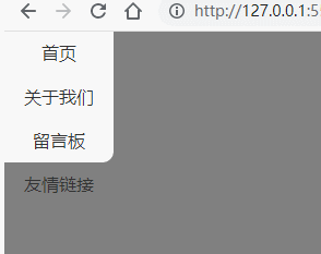
js方案大体就是这个样子,也完美的实现了圆角
我在搜索的时候看到有人使用的是CSS方案,我也试了试
🚄CSS 方案
监听 li 的点击事件
点击li 添加类名 通过 CSS 的选择器来实现不同的样式,并且省去js方案的判断
🔎原理
当然了CSS方案肯定是不能监听点击事件的,还得是js 监听 添加 类名
通过CSS 选择器 来个 当前点击的 li 来装饰样式
li 的伪类元素 负责切圆角
a 的伪类元素 负责 填充空隙
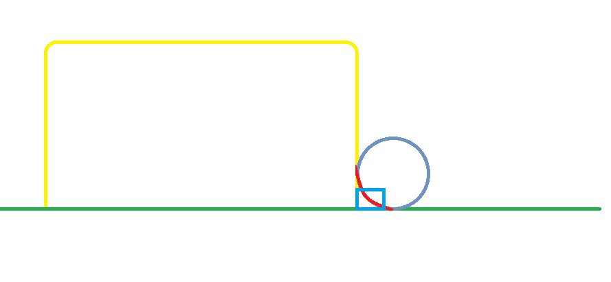
颜色
描述
黄色
标签页
红色
最终想要得圆角
淡蓝色(圆形)
切割圆角
蓝色(长方形)
填充空隙
左右都是相同原理不再赘述
DOM结构 总体上只有css,js 的结构变化最大
1 2 3 4 5 6 7 8 <div class ="main" > <ul > <li class ="active" > <a href ="#" > 首页</a > </li > <li > <a href ="#" > 关于我们</a > </li > <li > <a href ="#" > 留言板</a > </li > <li > <a href ="#" > 友情链接</a > </li > </ul > </div >
CSS 结构 层级关系
大概是这个样子,最后在调整一下就好了,换一下颜色
1 2 3 4 5 6 7 8 9 10 11 12 13 14 15 16 17 18 19 20 21 22 23 24 25 26 27 28 29 30 31 32 33 34 35 36 37 38 39 40 41 42 43 44 45 46 47 48 49 50 51 52 53 54 55 56 57 58 59 60 61 62 63 64 65 66 67 68 69 70 71 72 73 74 75 76 77 78 * { padding : 0 ; margin : 0 ; } a { text-decoration : none; color : #333 ; } body { background-color : rgb (128 , 128 , 128 ); } li { text-align : center; background-color : #fff ; height : 40px ; width : 100px ; line-height : 40px ; list-style : none; } li a { display : block; } .active { position : relative; background-color : rgb (128 , 128 , 128 ); } .active ::after ,.active ::before { content : "" ; position : absolute; right : 0 ; display : block; width : 15px ; height : 15px ; background-color : #fff ; } .active ::before { top : -15px ; border-bottom-right-radius : 10px ; z-index : 1 ; } .active ::after { bottom : -15px ; border-top-right-radius : 10px ; } .active a { position : relative; } .active a ::after ,.active a ::before { content : "" ; display : block; position : absolute; right : 0 ; width : 10px ; height : 10px ; background-color : #808080 ; } .active a ::after { bottom : -10px ; } .active a ::before { top : -10px ; } ul li :last-child .active ::after ,ul li :last-child a ::after ,ul li :first -child.active ::before ,ul li :first -child a ::before { display : none; }
js 结构 1 2 3 4 5 6 7 8 9 10 11 12 13 14 15 16 let lis = document .querySelectorAll ('.main li' );lis.forEach ((item ) => { item.addEventListener ('click' , function ( RemoveClassName (lis); this .className = 'active' }) }) function RemoveClassName (arr ) { arr.forEach (item => item.className = '' ; }); }
最后感觉还是 CSS的方案更好,代码简洁更易懂。最终效果